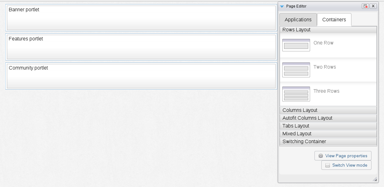
The biggest change to having responsive portlets is that the site is no longer set at a fixed width. The width of the page will adapt to the size of the screen used to display the page. As such portlets which have been designed to fill a specific fixed space may not render correctly when the screen width differs from what it expects. This includes things like overflowing content, contents being clipped, content flowing into a new line, etc.
Responsive portlets must be written in a more fluid manner where the layout changes based on the width of the page. This is done in the same manner as creating any normal responsive html page, by mostly using CSS3 media queries. There is nothing inherently different about this approach with portlets and there are no special apis or other data which must be gathered from the portal itself.
As already mentioned in the limitation section and creating a responsive site section, the site should be done in a row layout. With each portlet stacked one on top of another and taking up more or less the actual width of the page, it makes it easier to configure the portlet's css to be responsive. 
It is up to the admin and portlet developer to make sure that the portlets are responsive and are rendered correctly when the screen size changes. It is possible to set the width of the container holding the portlet to a specific width, but this will overflow outside of the normal page size if the browsers width is narrowed beyond this.